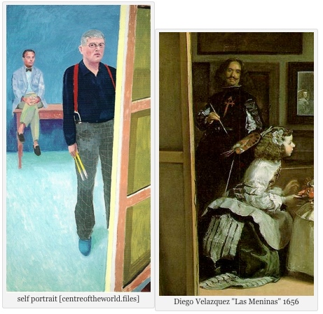
 More “David Hockney: a Bigger Exhibition.” This week we move from the technical to the conceptual—Hockney’s variations on the works of other artists.
Variations can be a perfectly sound way of paying homage or making a joke, or, as in the self portrait here, making a point about beginnings and ends. Velazquez’s “Las Meninas” is so iconic that the mere presence of the foreground canvas frees Hockney from having to make any further references to his starting point, and gives him freedom to play. The simpler, colorful space, the cool seated figure instead of las meninas, and his own, defiantly prosaic pose speak for themselves. And the engaging thing about it is that it’s a strong and typically Hockneyesque piece. He isn’t copying, he isn’t sneaking a ride; he’s quoting, and demonstrating how he can take Velazquez’s elements to a very different place. A strong, bold piece.
So far, so good.
![The Sermon on the Mount 1656 [frick.org]](http://www.stanwashburn.com/wp-content/uploads/2014/01/Claude-The-Sermon-on-the-Mount-1656-frick.org_.jpg)
But then we get to “A Bigger Message,” based on “The Sermon on the Mount” by Claude Lorraine. Hockney has executed this in several wall-sized versions. As with the Velazquez, the Claude is both legendary and sui generis, so that the significance of whatever new path Hockney chooses to follow will be right up front.
Or would be if there were some. But while Hockney does elegant, playful things with his self portrait, “A Bigger Message” is a pretty literal, paradingly gaudy copy of the Claude. It’s unclear to me what the Bigger Message might be. Perhaps it gets spelled out in the exhibition catalogue, which I haven’t read. But whereas “Las Meninas” is no more than the superb
!["A Bigger Message" [thesundaytimes.co.uk]](http://www.stanwashburn.com/wp-content/uploads/2014/01/Hockney-a-Bigger-Message-thesundaytimes.co_.uk_.jpg)
depiction of a social moment, leaving Hockney free to play with the room and the clothes and the personalities without missing anything essential, the Claude is about Jesus preaching. The landscape is designed to dramatize the story. But the religion thing doesn’t seem to engage Hockney at all. Without that, he’s just riding on a famous piece and saying, “See, my style is different.” Which I would never have doubted, and didn’t need to see proved, especially in such a loud voice.
So that one’s a disappointment.
And then we come to a truly odd whim, “The Massacre and the Problems of Depiction.” This is a feeble copy of “Massacre in Korea,” one of Picasso’s misguided ventures into social commentary.* Picasso really had nothing to say about war; Hockney’s “problem of depiction” seems to be that he also has nothing to say about it, or about Picasso, either, so far as that goes. He adds that odd little image of a photographer at the bottom, but the shared frame and its gray tones are its only points of connection with the principal image. Perhaps he’s saying that we are witnesses. Or at least he is. Or Picasso was. Or something. But with all the substantial portraits and landscapes to be encountered elsewhere in the exhibition–or the striking self-portraits–this “Massacre”–a dud elaborating on a dud–is definitely a distraction, and another disappointment.
![Picasso "Massacre in Korea" 1951 [Musee Picasso Paris]](http://www.stanwashburn.com/wp-content/uploads/2014/01/Picasso-Massacre-in-Korea-1951-Musee-Picasso-Paris.jpg)
!["The Massacre 2003 [deyoungmuseum.tumblr.com]](http://www.stanwashburn.com/wp-content/uploads/2014/01/Hockney-The-Massacre-etc-2003-deyoungmuseum.tumblr.com_1.jpg)
*For more on Picasso and war, see the posts for December 28, 2013, and February 13, 2012.